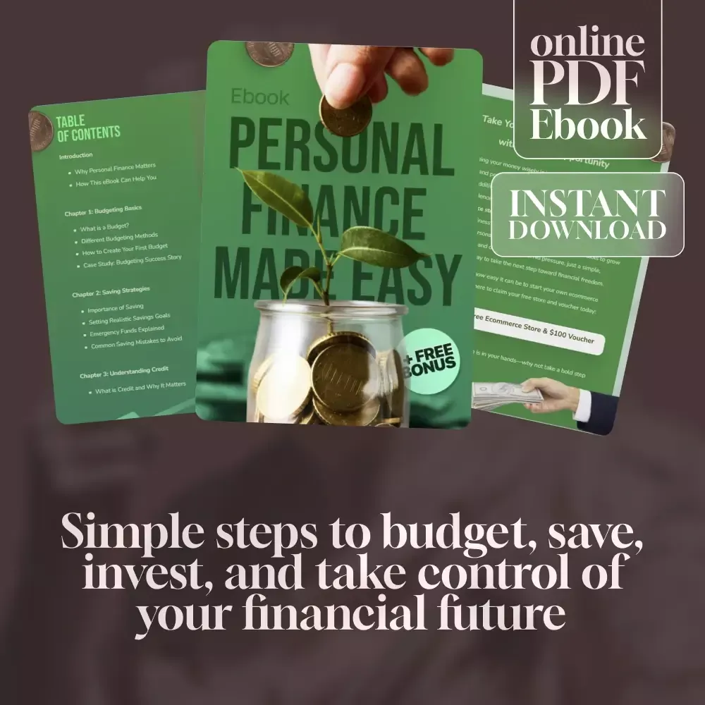


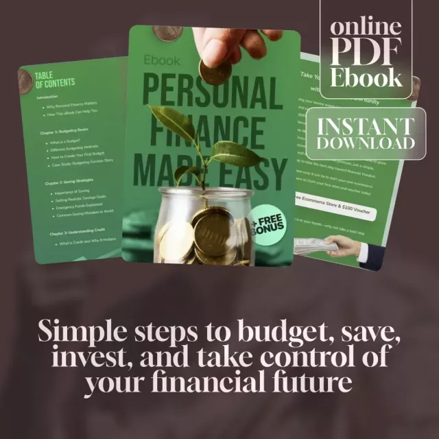
Take control of your money with confidence using the Personal Finance Made Easy Ebook—your all-in-one guide to budgeting smarter, saving more, and building a secure financial future. Whether you’re just starting your money journey or looking to level up your financial skills, this easy-to-follow eBook breaks down complex concepts into clear, actionable steps. You’ll learn how to make your money work for you instead of the other way around.
What’s Inside
- Budgeting Basics: Learn different methods and create your first budget
- Saving Strategies: Set achievable goals, build an emergency fund, and avoid common mistakes
- Understanding Credit: Build, maintain, and protect your credit score
- Basics of Investing: Explore stocks, bonds, and mutual funds with simple steps to start
- Financial Planning for the Future: Plan for retirement, insurance, and long-term goals
- Managing Debt Wisely: Strategies to pay off debt and avoid traps
- Putting It All Together: Track your progress and adapt as life changes
Practical Benefits
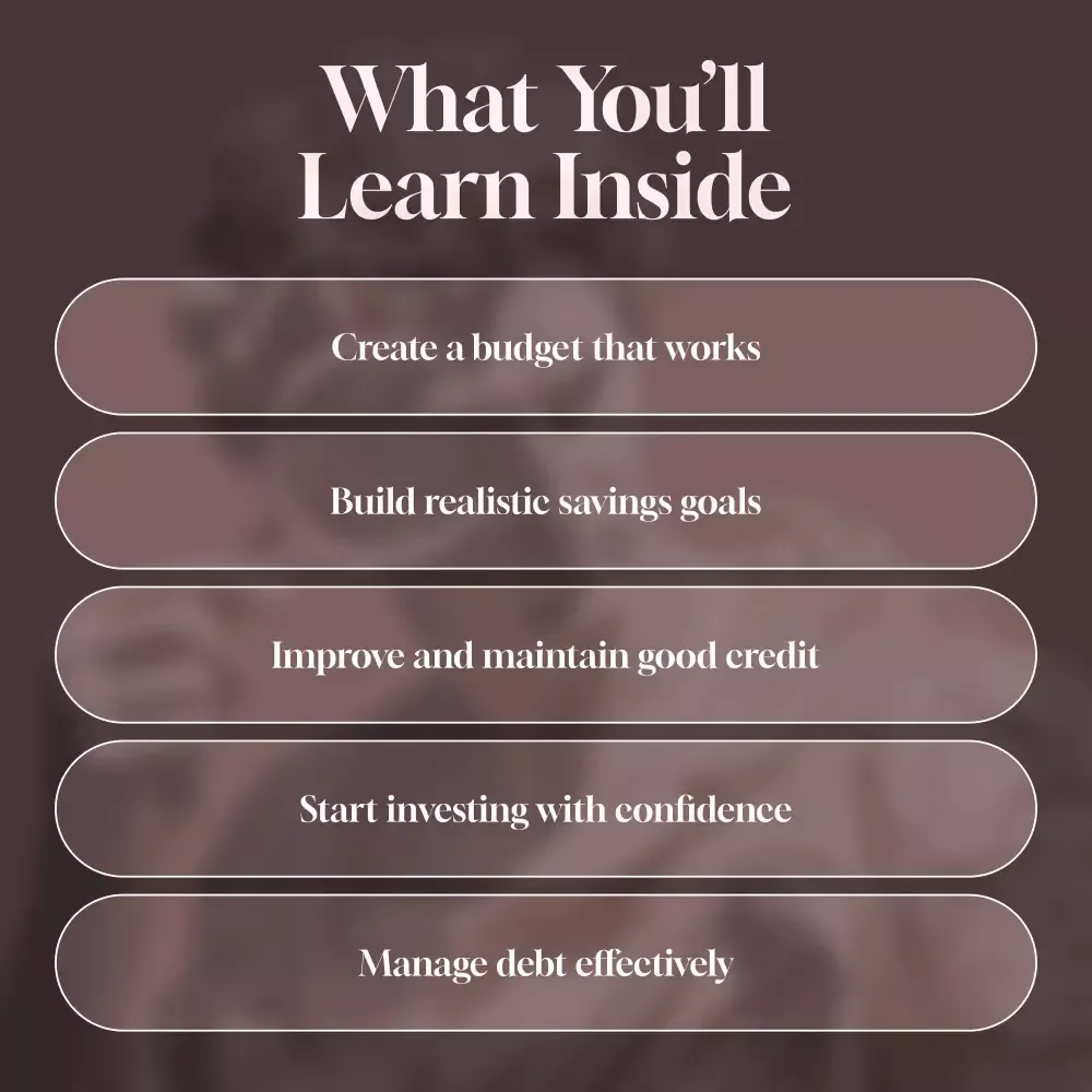
- Master budgeting without overwhelm
- Build healthy saving habits that stick
- Improve and protect your credit score
- Start investing with confidence
- Create a plan for lasting financial freedom
Why This Ebook is Different
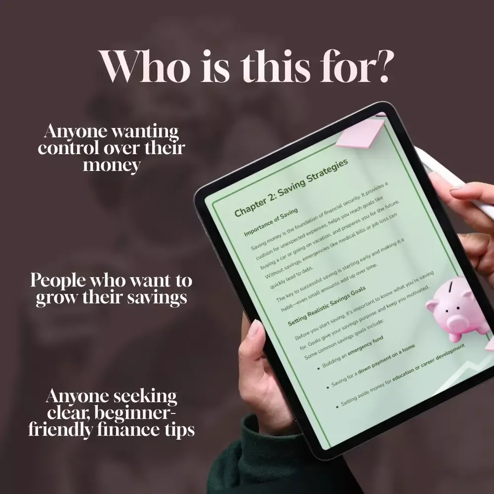
The Personal Finance Made Easy Ebook takes the guesswork out of money management. Instead of jargon-filled advice, you get relatable examples, real-life case studies, and step-by-step strategies you can start using today. It’s practical, beginner-friendly, and designed for everyday people who want real results.
Take Action
Start building the financial future you deserve. Download the Personal Finance Made Easy Ebook now and take the first step toward a stress-free money life.
Order cancellation
All orders can be cancelled until they are shipped. If your order has been paid and you need to make a change or cancel an order, you must contact us within 12 hours. Once the packaging and shipping process has started, it can no longer be cancelled.
Refunds
Your satisfaction is our #1 priority. Therefore, you can request a refund or reshipment for ordered products if:
- If you did not receive the product within the guaranteed time( 45 days not including 2-5 day processing) you can request a refund or a reshipment.
- If you received the wrong item you can request a refund or a reshipment.
- If you do not want the product you’ve received you may request a refund but you must return the item at your expense and the item must be unused.
We do not issue the refund if:
- Your order did not arrive due to factors within your control (i.e. providing the wrong shipping address)
- Your order did not arrive due to exceptional circumstances outside the control of simpledevices.shop (i.e. not cleared by customs, delayed by a natural disaster).
- Other exceptional circumstances outside the control of https://simpledevices.shop
*You can submit refund requests within 15 days after the guaranteed period for delivery (45 days) has expired. You can do it by sending a message on Contact Us page
If you are approved for a refund, then your refund will be processed, and a credit will automatically be applied to your credit card or original method of payment, within 14 days.
Exchanges
If for any reason you would like to exchange your product, perhaps for a different size in clothing. You must contact us first and we will guide you through the steps.
Please do not send your purchase back to us unless we authorise you to do so.
Instant download
Your purchase will be available to download once payment is confirmed.
Instant download items don’t accept returns, exchanges or cancellations. Please contact us if you have any problems



Love this ebook! It's been a huge help in getting my finances on track. The budgeting tips are so practical and easy to follow, I've already started saving more money each month. 🙌
Super helpful 🔥
Navigating the world of personal finance can be overwhelming, especially when you're not sure where to begin. That’s why I was pleasantly surprised by how accessible and clear this ebook is. It breaks down budgeting, saving, investing, and debt management into straightforward steps, making it much easier to understand. The guidance provided on investing, in particular, has boosted my confidence and inspired me to take my first steps toward building wealth. What I truly appreciate is that it doesn’t feel like it’s written for experts – it’s designed for everyday people, and the language is simple but effective. This ebook has definitely helped me shift my mindset, and I feel much more in control of my finances than I ever have before.
I recently came across this personal finance guide, and it’s quickly become one of the most practical books I’ve read in a while. 📚 I’ve gone through a lot of finance literature over the years, but this one really stands out—and not because it tries to dazzle you with complicated theories. What makes it different is how clear and approachable it is. Right from the start, the language is simple and easy to follow. There’s no financial jargon or overwhelming technical talk—just straightforward advice that’s easy to understand and apply. Whether you’re trying to create your first budget or explore investing for the first time, the guidance here is laid out in a way that makes you feel confident taking action. One of the things I appreciate most is how achievable everything feels. The steps are practical and realistic, which makes it much easier to actually follow through. Instead of feeling overwhelmed, I find myself thinking, “Yes, I can do this.” That’s a refreshing change compared to some finance books that make progress seem out of reach. It also addresses debt in a helpful, no-nonsense way. 💡 The strategies for managing and reducing debt are straightforward, and they’ve already helped me feel more in control of my own repayment plan. It’s not about unrealistic promises—it’s about giving you tools and ideas you can actually use right away. Another big plus is how adaptable the advice is. You don’t have to be at a certain stage in life or earn a specific income to benefit from it. The tips work whether you’re just starting to get serious about your finances or you’ve been at it for years but want to sharpen your approach. If your finances have been feeling chaotic or uncertain, this guide is a solid place to start. 🌟 It’s practical, encouraging, and easy to revisit whenever you need a boost of clarity or motivation. Honestly, it feels less like reading a book and more like having a supportive, knowledgeable coach walking you through each step.
I'm seriously impressed by how straightforward this guide makes everything seem. From budgeting to saving, it’s all made simple and achievable!
The debt management section alone is worth its weight in gold! I feel less stressed about my financial situation now that I have a plan in place thanks to this ebook.
👍
Been using the techniques from the book for months now - they work wonders! My favorite part? How it simplifies investing concepts into digestible bits everyone can understand and apply 👍
This is not just another dry finance book; it's engaging, approachable, and packed full of actionable tips that really make a difference!
Ok
I can honestly say this ebook completely transformed the way I approach managing my finances. It takes a refreshing, no-nonsense approach that cuts through all the typical jargon and confusing formulas that often make personal finance feel intimidating. Instead, it provides straightforward, actionable advice that’s easy to follow, which I really appreciate. I feel empowered to make smarter decisions, whether it's budgeting, saving, or even investing, all while keeping my financial goals in sight. It’s been a game-changer for me, and I now feel like I’m on the right path toward financial independence – a goal that once seemed far off, but now feels entirely achievable. 🚀
Just finished reading this ebook and wow, it's a lifesaver! The budgeting tips are practical and easy to implement. Saving has never been easier for me. 👍
🔥🔥🔥
This book is fantastic! I was clueless about investing before but now I feel confident in my ability to grow my wealth. Definitely recommended.
The advice on achieving financial freedom in this book is top-notch. It covers everything from saving to investing - all made super simple!
excellent
This guide really does make personal finance easy! The strategies provided have helped me manage my debts better than ever before.
I just wrapped up reading this ebook, and I have to say, I’m genuinely impressed! Debt management has always been a major struggle for me, and for the longest time, I felt like I was drowning in it. However, this guide broke everything down so clearly, I now feel much more in control of my financial situation. The step-by-step approach made complex concepts so easy to understand, and I especially appreciated the practical advice that I could immediately put to use. Since applying what I’ve learned, I’ve already started seeing real improvements in my financial freedom. I feel more optimistic about my future and empowered to keep moving forward on this path. It’s definitely a resource I’ll refer back to as I continue my journey to financial independence 🙌
Not bad
I used to be clueless about investing until I read this ebook. It's straightforward with its advice and now I feel confident making investment decisions 💪💰.
❤️
This debt management guide is worth every penny! Cleared up all my confusion about debts, loans, interest rates... Now, I'm on track towards achieving financial freedom faster than expected 😊.
If you want your money matters sorted out, get your hands on this ebook ASAP! The investing section alone has changed how I view my finances entirely 🚀.
Amazing guide
The book offers clear guidance on saving without feeling deprived or overwhelmed - just what i needed!! Already noticing a difference in my bank account balance 😁👏
I never imagined dealing with debt could actually feel less stressful, but after reading this guide, I’m a true believer. The strategies laid out were not only easy to follow but also incredibly effective in helping me tackle my debts with a clearer mindset. I’ve been struggling with financial stress for a while, but this guide helped me break it down step by step, reducing the overwhelming feeling I once had. The techniques really focus on practical, actionable steps, which I’ve been able to incorporate into my daily life right away. I’m already noticing how much more in control I feel, and the weight on my shoulders is definitely lighter. This ebook has been a game-changer in helping me reduce financial anxiety and move toward a more peaceful financial future 💆♀️💳
Love this ebook! It's like having a personal finance coach. The budgeting tips have helped me save more than I ever thought possible. 🙌
👍👍👍
I never realized how much I needed this until I started reading it. Now, financial freedom feels within reach.
Wish I found this sooner! It’s made saving easy and even fun - something I never thought possible before.
Awesome
I can’t believe how much of a difference the debt management strategies in this guide have made for me. They’re straightforward, practical, and, most importantly, effective. I’ve always felt a bit lost when it came to managing my debt, but this guide has provided me with a clear and manageable path forward. The techniques are easy to understand, and the way they break down each step has given me the confidence to tackle my debt head-on. I’m already starting to feel a weight lifted off my shoulders, knowing I have a solid plan in place. With this newfound clarity, I’m optimistic about the future and excited to see how much progress I can make.
🔥
If you want to take control of your finances, you need this guide in your life. Budgeting has become second nature to me now 😊
This book is an absolute lifesaver for anyone who's having a tough time navigating their financial woes. It ain't just some dry how-to manual y'know; it genuinely feels like you've got yourself a mentor in your corner, showing you the ropes on everything from budgeting to saving and even dipping your toes into investing. What really caught my eye though? That'd be the chapter that dives deep into debt management. This isn't just some vague advice thrown around - we're talking about clear-cut steps that'll help you whittle down those debts and regain command over your money matters. Now don’t get me wrong here! The book doesn't peddle any of those 'get rich quick' schemes or promise success overnight. Nah mate, what it does offer are real-deal strategies designed to bring about lasting change in your financial life. It's not about taking shortcuts but rather arming yourself with knowledge and skills to build a solid foundation for managing finances effectively. Whether you’re trying to save up for something big or merely looking to keep your head above water month after month, this book has got the goods! So if you find yourself constantly wrestling with bills or simply want to learn more about handling money wisely – this gem of a guide is worth every penny! Trust me when I say it’s going to give you practical tools and tips that’ll make all the difference between sinking deeper into debt or swimming towards financial freedom. And hey, let’s not forget – learning should never feel like drudgery! The author keeps things engaging throughout so there's no chance of dozing off halfway through reading this one! So buckle up folks because once you dive into these pages, there’s no turning back from becoming financially savvy!
This is not just another boring finance book; it's an engaging read with real-life examples that bring concepts to life!
Budgeting used to stress me out but thanks to these techniques, it feels manageable now ✔️ Financial freedom here I come!
Highly recommended
I was drowning in debt until I came across this guide. It offers practical debt management strategies that genuinely work. My financial health is finally improving!
This book has been my saving grace when it comes to investing. Always found the topic intimidating but the simple explanations made everything clear as day.
❤️❤️❤️
If you’ve been struggling with personal finance the way I was, I highly recommend you grab this guide right away! It covers everything you need to know, from budgeting and saving to investing and debt management, all in a way that’s easy to understand and apply. I’ve found it incredibly helpful, especially since it’s not just about theory, but real strategies I can use in my day-to-day life. The guide has a way of breaking down complex topics into digestible chunks, making each area feel achievable instead of overwhelming. Thanks to the clear steps it lays out, I now feel far more confident in managing my money and planning for my future. Whether you're looking to get out of debt or start building wealth, this guide is a game-changer.
Never thought an ebook could teach me so much about personal finance! From savvy budgeting techniques to smart investment tips - every page is worth its weight in gold 💰
Super informative 🔥
This ebook is a lifesaver! The saving tips are practical and doable even for those with tight budgets. Now, I see financial freedom in sight.
What an insightful read! The investing advice has given me the courage to make smart investments. Can't wait to grow my wealth!
Ok
I've always struggled with personal finance until this guide came along. It's like having a friend explain everything without any jargon or complicated terms.
The simplicity of this ebook is its strength - it makes complex topics approachable for beginners like myself who want financial independence.
👍
This ebook has truly been a revelation for me! Personal finance always seemed like such a complex and overwhelming topic, but this guide made it so much simpler to grasp. The budgeting techniques, in particular, are straightforward and easy to put into action. I’ve already seen a noticeable improvement in how I manage my expenses, and I finally feel in control of my finances. What’s even better is that the advice doesn’t feel like a one-size-fits-all approach — it’s tailored in a way that feels personal and achievable. This ebook has not only given me the tools to budget better, but it’s also changed my mindset about money in a very positive way. I'm genuinely excited to continue using these strategies and keep building on this newfound financial confidence 🙌
This guide is truly empowering! It's helped me build an effective savings plan that works for my lifestyle. I'm finally saving more than I ever thought possible 😃.
Very helpful
Seriously, where has this been all my life? The investing advice is top-notch - straightforward yet insightful. My portfolio has never looked better 💰!
The best part about this guide? It simplifies complex financial topics into digestible chunks. Even someone with no prior knowledge can easily grasp the concepts 👏.
Not bad
This ebook demystified the world of investing for me—no jargon or complicated theories involved. Just simple steps anyone can follow to grow their wealth ✅ .
If managing your finances feels like a constant struggle, I can’t recommend this guide enough—it’s a game changer! The advice is practical, and the debt management tips, in particular, have been absolute lifesavers. They’ve not only helped me regain control of my finances but also given me a sense of relief and clarity that I never thought possible. What really stood out to me was how easy the tips are to implement, even with a busy schedule. I’ve been able to take small, actionable steps that are making a big difference in how I approach my money. If you're feeling overwhelmed, this guide will help you break everything down into manageable pieces, and trust me, you’ll feel much more confident and in control moving forward 💯
🔥🔥🔥🔥
Picked up some great tips on how to save money without drastically changing my lifestyle from this e-book—it's made such a positive impact on my financial health already ❤️🔥 !
Wow! The budgeting tips in this ebook really helped me get a handle on my spending. I've been able to save so much more since reading it! 😃
ok
This debt management advice is priceless. I feel like a weight has been lifted off my shoulders now that I have a plan to pay down my debts.
The saving strategies are practical and easy to implement. My savings account balance has never looked better!
Life changing 👍
If you're struggling with finances as much as i was, you need this guide! It's made such a difference in my life already!
I’ve always struggled to find a budgeting plan that actually fits my lifestyle, but this ebook completely changed that. It taught me how to create a budget that works for me, not some generic, one-size-fits-all plan that an expert designed without considering my unique needs. The approach feels personalized, and I was able to tailor the advice to my own situation, which made it feel far more achievable. I’ve learned to set realistic goals that align with my income, priorities, and spending habits, and the results have been amazing. It’s given me the tools to manage my money in a way that feels both practical and sustainable. I finally feel like I’m in control of my finances, and I’m confident I can maintain a budget that actually works long-term.
❤️
What a revelation! This ebook has truly simplified the world of personal finance for me. Budgeting, saving and investing are no longer daunting tasks but achievable goals. Debt management? It's now a breeze!
I've been struggling with my finances for years, this guide made it so much easier to understand. The step-by-step process in budgeting is just perfect! 💯
Clear guidance
The best part of this ebook is how it breaks down complex financial concepts into simple language that anyone can understand - even someone like me who's always found finance intimidating.
From being clueless about where my money goes every month, to having a solid savings plan - all thanks to this amazing guide on personal finance. Highly recommended 🙌
👍👍👍
This guide has changed the way I see debt management completely – from something scary and overwhelming to manageable steps towards becoming debt-free.
I can’t express how much of a lifesaver this ebook has been for me! For so long, I felt like I was drowning in debt with no clear way out, but this guide gave me the clarity and confidence to finally take control of my finances. The debt management strategies are spot-on and helped me create a clear path toward financial freedom. On top of that, the savings tips are incredibly practical, and I love how easy they are to incorporate into my daily routine. I was amazed at how simple changes could make such a big impact on my overall financial health. This guide has truly empowered me to take charge of my money, and I’m now seeing real progress toward my financial goals. I feel more in control than ever before, and I can’t recommend it enough! 👍
Must read
I've struggled with budgeting my entire adult life, but this guide made it so much easier! The strategies are straightforward and effective - no more living paycheck to paycheck for me!
The saving advice in this ebook is top-notch! It's taught me how small changes can lead to big savings over time. My bank account has never looked healthier 🎉
Being someone who would always get a bit shaky when it came to the realm of personal finance, this ebook has been nothing short of an eye-opener. It's like a light bulb clicked on in my head and suddenly all those daunting topics such as investing and saving didn't seem so scary anymore. The way this guide dissects these intricate subjects into bite-sized, digestible chunks is truly commendable. It doesn’t just give you the information; it makes sure you understand it too! And that’s what I found most beneficial about this resource. Now let's talk about the debt management advice because man, was that something or what! This wasn't your typical "pay off your debts" kind of spiel but legit practical steps one could follow without feeling overwhelmed. The guidance given here isn't just fluff; it's actionable stuff which means you can actually do something with the information provided instead of letting it sit in some corner gathering dust. And guess what? These strategies work! They're effective and they deliver results which are precisely why I'm singing praises for this ebook right now. One thing that stood out for me personally was how much emphasis was laid on making things simple for readers like myself who aren’t exactly savvy when it comes to finances. The language used throughout is easy-going and conversational which made reading through the content feel more like having a chat with a friend rather than going through some boring textbook. So yeah, if anyone were to ask me today whether or not they should give this ebook a shot, I'd say go for it without batting an eyelid because trust me folks - financial freedom seems less elusive once you've got hold of this gem!
If you're feeling overwhelmed by your finances, get this book now. It covers everything from budgeting to investing and makes it all feel manageable.
Highly recommended!
Absolutely loved the debt management section of this ebook – it gave me hope when I felt stuck under mountains of bills. Now I'm on track towards becoming debt-free!
Never thought getting control over my finances could be so simple until reading this guide! The tools provided have really helped streamline my budgeting process.
🔥
Saving money has always been a challenge for me, but after reading this guide, I feel like I finally have a solid grip on it! The advice is straightforward and incredibly practical, with tips that I can actually implement in my everyday life. I especially love how the guide breaks down the process into simple steps, making it less overwhelming and more achievable. Since applying the strategies, I've noticed a real shift in my ability to save, and it's been such a relief to watch my savings grow. It’s not just about the theory, either—these are actionable tips that get results. This guide has made managing my money feel a lot more manageable, and I can’t wait to see even more progress moving forward! 😊
Extremely helpful!
This debt management guide has been a lifesaver. I was drowning in credit card debts before, but now I see light at the end of the tunnel.
If you're looking for financial freedom, get this book right away! The author explains everything clearly without any jargon - perfect for beginners!
❤️❤️❤️❤️
This guide is filled with valuable information about achieving financial independence through smart investing and saving techniques - highly recommended!
After following its debt management plan, I'm finally able to sleep better at night knowing that my finances are under control.
The step-by-step instructions on how to save effectively have enabled me to put aside more money than ever before – love it!
very informative
I just finished reading this ebook, and I’m honestly blown away by how helpful it is. The budgeting tips are so practical and down-to-earth, which makes managing my money feel so much easier than before. I love how the advice is not only realistic but also flexible, allowing me to adjust it to my own financial situation. Instead of feeling overwhelmed by complicated formulas, I now feel empowered to make smarter money choices every day. The clarity and simplicity of the strategies have helped me gain a clearer picture of where my money is going, and I already feel more in control of my finances. It’s a total game-changer, and I’m excited to keep using these tools moving forward! 🙌
I've always struggled with saving but this guide has shown me how simple it can be! Debt management section is a lifesaver too!
👍
Wow, the financial freedom that comes from understanding personal finance is amazing! This guide helped me get there. 👍
If you're like me and needed help with your finances, then you need to check out this ebook! The advice on saving alone has changed my life.
Packed with tips 👍
Wow, this ebook was a lifesaver! It broke down complex finance topics into simple terms. Now I'm budgeting like a pro and saving more than ever before!
I’ve gone through a few other finance guides before, but this one really takes the cake. The debt management section is absolute gold – it’s the first time I’ve felt like I’m actually making real progress in tackling my credit card debt. The steps are so clear and manageable, and the advice is practical, not just theoretical. I’ve been able to implement the strategies right away, and I’m already seeing a reduction in what I owe. For the first time in a long while, I feel like there’s light at the end of the tunnel. This guide has given me the confidence to keep going, and I’m excited to continue using its tools to take control of my financial future.
🔥🔥🔥
Thanks to this book, I’m no longer intimidated by personal finance. It’s made budgeting easy and even fun for me 🎉
I used to struggle with savings but not anymore thanks to this guide! It gave practical tips that are easy to follow - highly recommended 👍
The simplicity of the language used in explaining difficult concepts is commendable. My financial literacy has improved greatly after reading it.
ok
I've always struggled with investing but this guide made it simple and straightforward! Now I'm seeing some real growth in my portfolio.
If you're looking for a financial guide that truly covers it all, this is the one you need. It’s clear, concise, and packed with useful information, making complex topics like debt management and savings so much easier to understand. I love how it doesn’t overwhelm you with unnecessary details – everything is straight to the point and actionable. Whether you’re trying to pay off debt, save for the future, or just get your finances in order, this guide has it all. Since using the strategies outlined, I feel much more confident in my ability to manage my money effectively. I highly recommend it to anyone who wants to take control of their finances without the stress or confusion!
Easy to follow
As a recent grad drowning in student loans, the debt management advice was invaluable. For the first time, I have hope for financial freedom.
If you're looking for an all-in-one solution to your financial woes, look no further. From budgeting to investing - it's got you covered!
❤️
This guide is amazing - the budgeting tips have really helped me to manage my money better. No more living paycheck to paycheck for me!
I used to feel completely overwhelmed by debt, like there was no way out, but this guide has truly been a game-changer. The strategies it offers for managing debt are practical, effective, and easy to follow, which has made all the difference in my financial journey. For the first time in ages, I feel like I’m in control instead of constantly worrying about my bills. I’ve been able to break down my debt into manageable chunks and create a clear plan to pay it off. It’s been so empowering to watch my progress and know that I’m moving toward financial freedom. I honestly can’t thank this guide enough – it’s helped me gain the confidence and clarity I needed to get on the right track! 🎉
Not bad
Loved the saving tips in this book! They're practical and easy to implement. My savings account is finally growing steadily.
The simplicity of the concepts presented here is refreshing – no jargon or difficult terms. Personal finance made truly easy!
👍👍👍
If you're struggling with your finances just like I was, get yourself a copy of this gem right away!
This isn't just another boring financial advice book; it's an engaging read packed with actionable insights.
This guide is everything I needed – clear, concise, and incredibly easy to follow. It cuts through all the noise and provides practical advice that’s simple to understand and apply. I love how it’s not overwhelming; instead, it breaks down complex financial concepts into bite-sized steps, making it feel much more manageable. The clarity of the information has given me the confidence to make smarter financial decisions every day. Whether you're new to personal finance or looking to get a better grip on your money, this guide offers exactly what you need without unnecessary fluff 🙌
Reading this ebook was like having a personal finance coach. The budgeting tips were practical and easy to implement, saving me both time and money!
The debt management guide in this ebook is an absolute lifesaver! I'm finally seeing the light at the end of my debt tunnel.
🔥
I've always struggled with savings but thanks to this guide I now have a solid plan for financial freedom 👍👍
Worth reading 💯
After reading this ebook, budgeting feels less like a chore. The strategies are simple yet effective – they’ve changed my perspective on managing money 💰💡
great resource